Website redesign
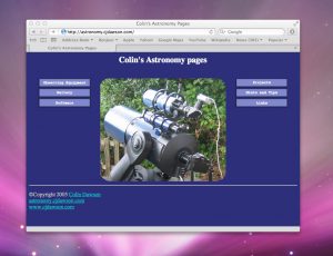
Time has finally come. After having had my astronomy site up and running for over 10 years, I figured that it is finally time to give my astronomy website a complete make over. The current site is rather inconsistent and has a very distinct 90’s style.
My plan is to bring the site up to day, give it a much more professional look and feel, and give me a better looking site to update everything from.
Before I even start to redesign the site. Let’s take a look at the current site in more detail. Some things will be good whilst others will be bad.
Navigation
The current overall design is difficult to navigate. There is only a link at the bottom of the page that returns you to the start. Apart from that you are expected to use the browser back button to go back to where you were before. This can make it awkward to view the picture galleries.
Images
This is where I made a huge mistake. On the original site. I decided to have a blue background. At the time, I thought it would look good if I took the time to break up the borders of the images to make it look less ridged. At first it looked ok, but the site was then stuck with it. To make things worse, over the years I have managed to loose the original paint shop pro images that I’d used to add the borders.
So, what can I do? I can’t remake everything. Some images I can clean up, others I can retake. All in all this serves as a good lesson in why it is important to keep all the original images safe. With any luck, the originals might show up, somewhere in the huge pile of backup CD’s that I have, or on the various hard drives that I have collected over the years.
Things to consider
Going forward, there are things that I wish to address to make the site look less like a 90’s self teaching website. There are things that I wish to have in the design.
- Easy navigation
- Google Ads
- Easy maintenance
Apart from these, at the moment I have not decided on anything specific. This leaves me with lots of questions.
- Which technology do I use to build the site? (notepad/dreamweaver/a content management system/wordpress/something else)
- how will the site look overall?
- How many of those images can I save?
There is lots to do, and that’s without adding any “New” content, which well the site hasn’t really had any updates for a while so it’s overdue for some more content as well.
Lots to do… watch this space.
Update (16-Feb-2012): I just found a folder full of images that I used on the Astronomy website. They’re all in Paint Shop Pro format. I will remove the border and save the files down as .png so as to make them play nicer with my current software. I’m hoping that I have a complete set of the images.


Enjoyed your talk last night & learned quite a few things!!!
Had a quick look-see at these blogs and web pages……impressive stuff….way beyond my pc fumblings!!!
Cheers
Gee